09 Ogos 2025, Sabtu, rakyat Singapura di seluruh dunia meraikan Selamat Hari Lahir Kebangsaan yang KEENAM PULUH 🎂2025 年 8 月 9 日,星期六,全球新加坡人庆祝六十岁国庆快乐🎂 2025 Nián 8 yuè 9 rì, xīngqíliù, quánqiú xīnjiāpō rén qìngzhù liùshí suì guóqìng kuàilè 🎂 ஆகஸ்ட் 09, 2025, சனிக்கிழமை, உலகெங்கிலும் உள்ள சிங்கப்பூரர்கள் அறுபதாவது தேசிய பிறந்தநாளை இனிய நாளாகக் கொண்டாடுகிறார்கள் 🎂 Ākasṭ 09, 2025, caṉikkiḻamai, ulakeṅkilum uḷḷa ciṅkappūrarkaḷ aṟupatāvatu tēciya piṟantanāḷai iṉiya nāḷākak koṇṭāṭukiṟārkaḷ 🎂 August 09, 2025, Saturday, Singaporeans worldwide celebrate Happy SIXTIETH National birthday 🎂 Le 9 août 2025, samedi, les Singapouriens du monde entier célèbrent leur soixantième anniversaire national 🎂
.jpg)
Direka bentuk untuk meraikan kejayaan 60 tahun rakyat Singapura, logo NDP 2025 ialah ekspresi berani perpaduan, gerakan dan semangat kebangsaan. Buat pertama kalinya, 25 warga Singapura dijemput untuk mencipta bersama.
2025 年国庆庆典标志旨在庆祝新加坡建国 60 周年,大胆表达了团结、活力和民族精神。这是该标志首次邀请 25 位新加坡人共同创作。2025 Nián guóqìng qìngdiǎn biāozhì zhǐ zài qìngzhù xīnjiāpō jiànguó 60 zhōunián, dàdǎn biǎodále tuánjié, huólì hé mínzú jīngshén. Zhè shì gāi biāozhì shǒucì yāoqǐng 25 wèi xīnjiāpō rén gòngtóng chuàngzuò.
சிங்கப்பூரர்களின் 60 ஆண்டு மைல்கல்லைக் கொண்டாடும் வகையில் வடிவமைக்கப்பட்ட NDP 2025 லோகோ, ஒற்றுமை, இயக்கம் மற்றும் தேசிய உணர்வின் துணிச்சலான வெளிப்பாடாகும். முதல் முறையாக, 25 சிங்கப்பூரர்கள் இணைந்து உருவாக்க அழைக்கப்பட்டனர்.
Ciṅkappūrarkaḷiṉ 60 āṇṭu mailkallaik koṇṭāṭum vakaiyil vaṭivamaikkappaṭṭa NDP 2025 lōkō, oṟṟumai, iyakkam maṟṟum tēciya uṇarviṉ tuṇiccalāṉa veḷippāṭākum. Mutal muṟaiyāka, 25 ciṅkappūrarkaḷ iṇaintu uruvākka aḻaikkappaṭṭaṉar.
Conçu pour célébrer les 60 ans de l'histoire des Singapouriens, le logo du NDP 2025 est une expression audacieuse d'unité, de mouvement et d'esprit national. Pour la première fois, 25 Singapouriens ont été invités à co-créer.
Designed to celebrate Singaporeans' 60-year milestone, the NDP 2025 logo is a bold expression of unity, motion, and national spirit. For the first time, 25 Singaporeans were invited to co-create.
Official Logo: A Symbol of Unity
The NDP 2025 logo captures the essence of who we are. Diverse, resilient, and always moving forward together.
It fuses “60” and “GO” into a single graphic mark, reflecting both our milestone and momentum. At its core, five shooting stars form an upward arrow, representing Singapore’s ideals of democracy, peace, progress, justice, and equality.
A visual rallying cry for all of us, to keep going.
Logo Rasmi: Simbol Perpaduan
Logo NDP 2025 menangkap intipati siapa kita. Pelbagai, berdaya tahan, dan sentiasa maju bersama.
Ia menggabungkan "60" dan "GO" menjadi satu tanda grafik, mencerminkan kedua-dua peristiwa penting dan momentum kami. Pada terasnya, lima bintang jatuh membentuk anak panah ke atas, mewakili cita-cita demokrasi, keamanan, kemajuan, keadilan dan kesaksamaan Singapura.
Seruan visual untuk kita semua, untuk teruskan.
官方标志:团结的象征
2025年国庆庆典标志体现了我们的精髓:多元、坚韧、始终携手前进。
它将“60”和“GO”融合成一个图形标志,既体现了我们的里程碑,也体现了我们前进的动力。标志的核心是五颗流星,组成一个向上的箭头,象征着新加坡的民主、和平、进步、正义和平等的理想。
这句视觉口号激励我们所有人继续前进。
Guānfāng biāozhì: Tuánjié de xiàngzhēng
2025 nián guóqìng qìngdiǎn biāozhì tǐxiànle wǒmen de jīngsuǐ: Duōyuán, jiānrèn, shǐzhōng xiéshǒu qiánjìn.
Tā jiāng “60” hé “GO” rónghé chéng yīgè túxíng biāozhì, jì tǐxiànle wǒmen de lǐchéngbēi, yě tǐxiànle wǒmen qiánjìn de dònglì. Biāozhì de héxīn shì wǔ kē liúxīng, zǔchéng yīgè xiàngshàng de jiàntóu, xiàngzhēngzhe xīnjiāpō de mínzhǔ, hépíng, jìnbù, zhèngyì hé píngděng de lǐxiǎng.
Zhè jù shìjué kǒuhào jīlì wǒmen suǒyǒu rén jìxù qiánjìn.
அதிகாரப்பூர்வ லோகோ: ஒற்றுமையின் சின்னம்
நாம் யார் என்பதன் சாரத்தை NDP 2025 லோகோ படம்பிடிக்கிறது. பன்முகத்தன்மை கொண்டவர்கள், மீள்தன்மை கொண்டவர்கள், எப்போதும் ஒன்றாக முன்னேறுபவர்கள்.
இது "60" மற்றும் "GO" ஆகியவற்றை ஒரே கிராஃபிக் அடையாளமாக இணைத்து, நமது மைல்கல் மற்றும் உந்துதலை பிரதிபலிக்கிறது. அதன் மையத்தில், ஐந்து நட்சத்திரங்கள் மேல்நோக்கிய அம்புக்குறியை உருவாக்குகின்றன, இது சிங்கப்பூரின் ஜனநாயகம், அமைதி, முன்னேற்றம், நீதி மற்றும் சமத்துவம் ஆகியவற்றின் இலட்சியங்களைக் குறிக்கிறது.
நாம் அனைவரும் தொடர்ந்து முன்னேற வேண்டும் என்ற ஒரு காட்சி அணிவகுப்பு முழக்கம்.
Atikārappūrva lōkō: Oṟṟumaiyiṉ ciṉṉam
nām yār eṉpataṉ cārattai NDP 2025 lōkō paṭampiṭikkiṟatu. Paṉmukattaṉmai koṇṭavarkaḷ, mīḷtaṉmai koṇṭavarkaḷ, eppōtum oṉṟāka muṉṉēṟupavarkaḷ.
Itu"60" maṟṟum"GO" ākiyavaṟṟai orē kirāḥpik aṭaiyāḷamāka iṇaittu, namatu mailkal maṟṟum untutalai piratipalikkiṟatu. Ataṉ maiyattil, aintu naṭcattiraṅkaḷ mēlnōkkiya ampukkuṟiyai uruvākkukiṉṟaṉa, itu ciṅkappūriṉ jaṉanāyakam, amaiti, muṉṉēṟṟam, nīti maṟṟum camattuvam ākiyavaṟṟiṉ ilaṭciyaṅkaḷaik kuṟikkiṟatu.
Nām aṉaivarum toṭarntu muṉṉēṟa vēṇṭum eṉṟa oru kāṭci aṇivakuppu muḻakkam.
Logo officiel : un symbole d’unité
Le logo du NPD 2025 incarne l’essence même de notre identité : diversité, résilience et toujours en mouvement.
Il fusionne les mots « 60 » et « GO » en un seul symbole graphique, reflétant à la fois notre étape importante et notre élan. En son cœur, cinq étoiles filantes forment une flèche ascendante, symbolisant les idéaux de Singapour : démocratie, paix, progrès, justice et égalité.
Un cri de ralliement visuel pour nous tous, pour continuer d’avancer.
Membayangkan semula Logo, Bersama.
Dalam inisiatif pertama seumpamanya, 25 warga Singapura, daripada artis hingga atlet, pendidik hingga usahawan mentafsir semula logo NDP melalui cerita mereka sendiri. Setiap varian mencerminkan harapan, kenangan dan impian peribadi untuk Singapura, mengubah simbol negara menjadi kanvas ekspresi individu. Bersama-sama, mereka membentuk potret siapa kita: banyak cerita, satu negara.
லோகோவை ஒன்றாக மறுகற்பனை செய்தல்.
முதன்முறையாக, கலைஞர்கள் முதல் விளையாட்டு வீரர்கள் வரை, கல்வியாளர்கள் முதல் தொழில்முனைவோர் வரை 25 சிங்கப்பூரர்கள் தங்கள் சொந்த கதைகள் மூலம் NDP லோகோவை மறுபரிசீலனை செய்தனர். ஒவ்வொரு மாறுபாடும் சிங்கப்பூருக்கான தனிப்பட்ட நம்பிக்கைகள், நினைவுகள் மற்றும் கனவுகளை பிரதிபலிக்கிறது, ஒரு தேசிய சின்னத்தை தனிப்பட்ட வெளிப்பாட்டின் கேன்வாஸாக மாற்றுகிறது. ஒன்றாக, அவர்கள் நாம் யார் என்பதற்கான ஒரு உருவப்படத்தை உருவாக்குகிறார்கள்: பல கதைகள், ஒரு தேசம்.
Lōkōvai oṉṟāka maṟukaṟpaṉai ceytal.
Mutaṉmuṟaiyāka, kalaiñarkaḷ mutal viḷaiyāṭṭu vīrarkaḷ varai, kalviyāḷarkaḷ mutal toḻilmuṉaivōr varai 25 ciṅkappūrarkaḷ taṅkaḷ conta kataikaḷ mūlam NDP lōkōvai maṟuparicīlaṉai ceytaṉar. Ovvoru māṟupāṭum ciṅkappūrukkāṉa taṉippaṭṭa nampikkaikaḷ, niṉaivukaḷ maṟṟum kaṉavukaḷai piratipalikkiṟatu, oru tēciya ciṉṉattai taṉippaṭṭa veḷippāṭṭiṉ kēṉvāsāka māṟṟukiṟatu. Oṉṟāka, avarkaḷ nām yār eṉpataṟkāṉa oru uruvappaṭattai uruvākkukiṟārkaḷ: Pala kataikaḷ, oru tēcam.
携手重塑标志。
在这项史无前例的活动中,25位新加坡人,从艺术家到运动员,从教育工作者到企业家,通过各自的故事重新诠释了国庆庆典标志。每个版本都体现了他们对新加坡的希望、回忆和梦想,将一个国家象征转化为一幅展现个人个性的画布。它们共同构成了一幅我们的肖像画:一个国家,一个故事。Xiéshǒu chóng sù biāozhì.
Zài zhè xiàng shǐwúqiánlì de huódòng zhōng,25 wèi xīnjiāpō rén, cóng yìshùjiā dào yùndòngyuán, cóng jiàoyù gōngzuò zhě dào qǐyè jiā, tōngguò gèzì de gùshì chóngxīn quánshìle guóqìng qìngdiǎn biāozhì. Měi gè bǎnběn dōu tǐxiànle tāmen duì xīnjiāpō de xīwàng, huíyì hé mèngxiǎng, jiāng yīgè guójiā xiàngzhēng zhuǎnhuà wéi yī fú zhǎnxiàn gèrén gèxìng de huàbù. Tāmen gòngtóng gòuchéngle yī fú wǒmen de xiàoxiànghuà: Yīgè guójiā, yīgè gùshì.
Reimagining the Logo, Together.
In a first-of-its-kind initiative, 25 Singaporeans, from artists to athletes, educators to entrepreneurs reinterpreted the NDP logo through their own stories. Each variant reflects personal hopes, memories, and dreams for Singapore, turning a national symbol into a canvas of individual expression. Together, they form a portrait of who we are: many stories, one nation.
Réinventer le logo, ensemble.
Dans le cadre d'une initiative inédite, 25 Singapouriens, artistes, athlètes, éducateurs et entrepreneurs, ont réinterprété le logo du NDP à travers leurs propres histoires. Chaque variante reflète leurs espoirs, leurs souvenirs et leurs rêves personnels pour Singapour, transformant un symbole national en un espace d'expression individuelle. Ensemble, ils dressent le portrait de qui nous sommes : une multitude d'histoires, une seule nation.
25 Stories, 1 Logo.
Explore the stories that shaped their logos. From childhood memories and family traditions, to reflections on belonging, purpose, and identity. Through them, we celebrate the many faces of Singapore, and the collective dream we share. Watch their stories here. (Facebook)
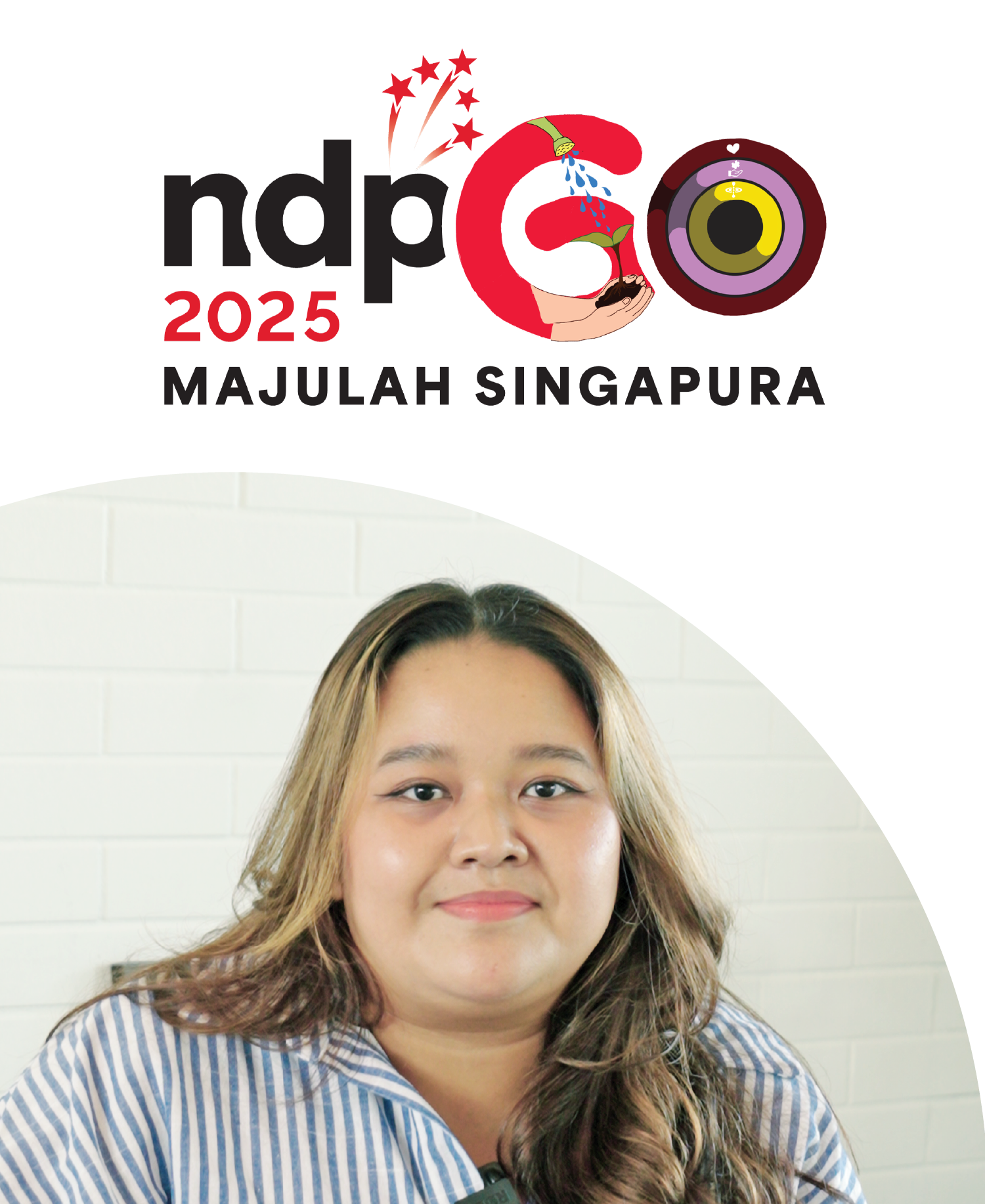
Aisha Shamsudin
- Mental Health Advocate
My logo is inspired by my journey as a mental health advocate and expresses my hopes for Singapore’s continued growth. The letter ‘G’ forms a pair of hands gently cradling a sprout, symbolising our nation’s progress and the importance of being grounded and humble. This imagery reflects my belief that even after 60 years, Singapore must keep learning and remain ready to support those in need just as the sprout depends on nurturing soil and caring hands. The letter ‘O’ is crafted in the style of smartwatch activity rings, offering a personal reflection of my life as a young Singaporean. Each ring embodies a key value, from outer ring to inner ring: “Love,” a reminder to show kindness to those who shape us; “Contribution,” representing my commitment to mental health advocacy and uplifting the Malay-Muslim community; and the third ring, “Present,” encouraging us to embrace the here and now despite life’s pace. My Singapore dream is for us to stay closely connected as a community that uplifts and empowers, while also nurturing each person’s unique identity.
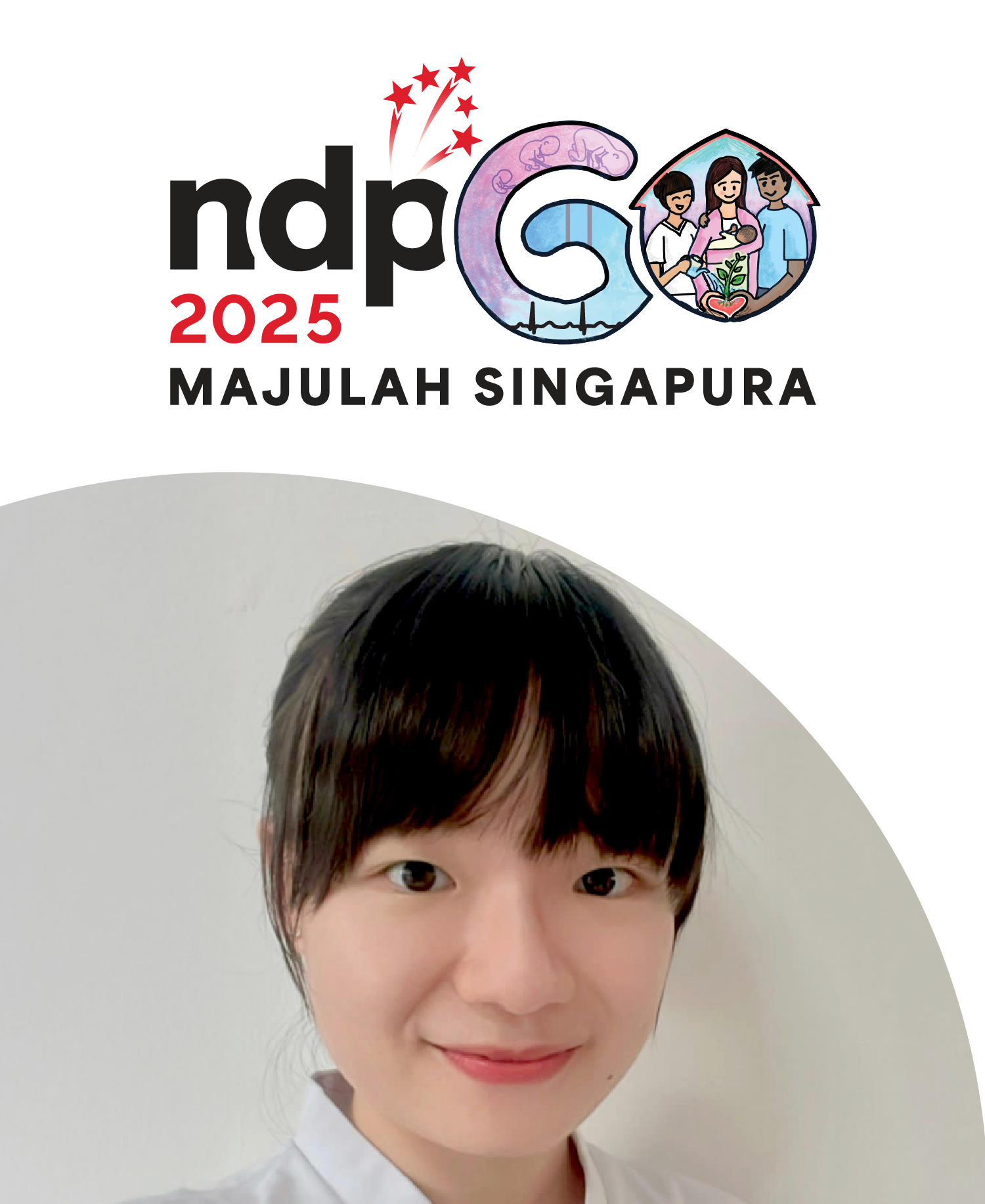
Pamela Tan
- Senior Staff Nurse, KK Woman's and Children's Hospital.
My logo design weaves together the journey of life, starting with the stages of pregnancy and the cycle of growth in the “6.” The two colours blend to form lilac, showcasing the union of maternal and paternal genes in life creation. The mother’s heart rhythms are emphasised after the positive pregnancy test, as her foetus develops a heartbeat and special connection to her. The rhythm, too, depicts the highs and lows of the pregnancy journey. The “0” encapsulates a multi-racial couple cradling their newborn, the sprouting plant from their nurturing love representing their growing child. A healthcare professional waters it and supports the family. The red roof highlights protection and care from hospital to home. My Singapore dream is for every mother to be empowered in providing the best environment for themselves and their children to thrive and flourish together.
25 histoires, 1 logo.
Découvrez les histoires qui ont façonné leurs logos. Des souvenirs d'enfance et des traditions familiales aux réflexions sur l'appartenance, le sens et l'identité. À travers elles, nous célébrons les multiples facettes de Singapour et le rêve collectif que nous partageons.
25 கதைகள், 1 லோகோ.
அவர்களின் லோகோக்களை வடிவமைத்த கதைகளை ஆராயுங்கள். குழந்தைப் பருவ நினைவுகள் மற்றும் குடும்ப மரபுகள் முதல், சொந்தம், நோக்கம் மற்றும் அடையாளம் பற்றிய பிரதிபலிப்புகள் வரை. அவற்றின் மூலம், சிங்கப்பூரின் பல முகங்களையும், நாம் பகிர்ந்து கொள்ளும் கூட்டுக் கனவையும் கொண்டாடுகிறோம்.
25 Kataikaḷ, 1 lōkō.
Avarkaḷiṉ lōkōkkaḷai vaṭivamaitta kataikaḷai ārāyuṅkaḷ. Kuḻantaip paruva niṉaivukaḷ maṟṟum kuṭumpa marapukaḷ mutal, contam, nōkkam maṟṟum aṭaiyāḷam paṟṟiya piratipalippukaḷ varai. Avaṟṟiṉ mūlam, ciṅkappūriṉ pala mukaṅkaḷaiyum, nām pakirntu koḷḷum kūṭṭuk kaṉavaiyum koṇṭāṭukiṟōm.
25 Cerita, 1 Logo.
Terokai cerita yang membentuk logo mereka. Dari kenangan zaman kanak-kanak dan tradisi keluarga, kepada refleksi tentang kepunyaan, tujuan, dan identiti. Melalui mereka, kami meraikan banyak wajah Singapura, dan impian kolektif yang kami kongsi.
25 个故事,1 个标志。
探索塑造这些标志的故事。从童年记忆和家庭传统,到对归属感、目标和身份的反思。通过它们,我们颂扬新加坡的多面性,以及我们共同的梦想。
25 Gè gùshì,1 gè biāozhì.
Tànsuǒ sùzào zhèxiē biāozhì de gùshì. Cóng tóngnián jìyì hé jiātíng chuántǒng, dào duì guīshǔ gǎn, mùbiāo hé shēnfèn de fǎnsī. Tōngguò tāmen, wǒmen sòngyáng xīnjiāpō de duōmiàn xìng, yǐjí wǒmen gòngtóng de mèngxiǎng.

Neyati Umamaheswar
- Founder of Minds Untangled
Through my logo, I aim to show both how far Singapore has come and the promising possibilities ahead, especially in how Singaporeans care for one another. My design features a brain and many hands coming together in support, trust, and unity. The brain represents a future-focused Singapore that values both intellect and emotion, reminding us that mental health touches everyone and that we grow stronger by embracing all aspects of ourselves. The stars symbolise our national pride and the aspirations of our youth, who carry tomorrow’s dreams. The hands united as one reflect my hope for a more compassionate society where everyone uplifts each other. My Singapore dream is for our nation to thrive through continuous growth, guided by open minds and courageous hearts, united in our diversity.
Melissa Tham
- Lead Volunteer, ItsRainingRaincoats
My design features migrant workers set against the backdrop of iconic Singapore landmarks such as HDB flats, Marina Bay Sands, and Gardens by the Bay. These elements pay homage to the essential role that migrant workers have played in shaping our nation’s infrastructure and landscape. I depicted the workers holding a spoon and an umbrella; the spoon symbolises the meals I have personally delivered as part of food distribution efforts, while the umbrella represents the charity organisation where I volunteer. These details reflect my own journey in volunteerism and my commitment to community service. My Singapore dream is for our country to remain an inclusive and welcoming home, growing ever stronger in humility, love, and compassion for all who contribute to our shared future.
Sam Lo
- Art Director of NDP 2025
My logo captures my vision of a progressive Singapore – one that embraces diversity, champions inclusivity, and supports its most vulnerable. Featuring distinct yet interconnected elements, it symbolises the nation’s many communities, each unique but essential to the whole. The bold colours and overlapping forms reflect a society where everyone is seen, valued, and empowered. Together, these elements form a vibrant tapestry that celebrates unity in difference. My Singapore dream is for the nation to be reminded that real progress is rooted in compassion, mutual respect, and equal opportunity for all. It’s both a tribute to what Singapore is and a call to build an even more empathetic and inclusive future.
Angel Ng
- Chief Operating Officer Connect Centre Group
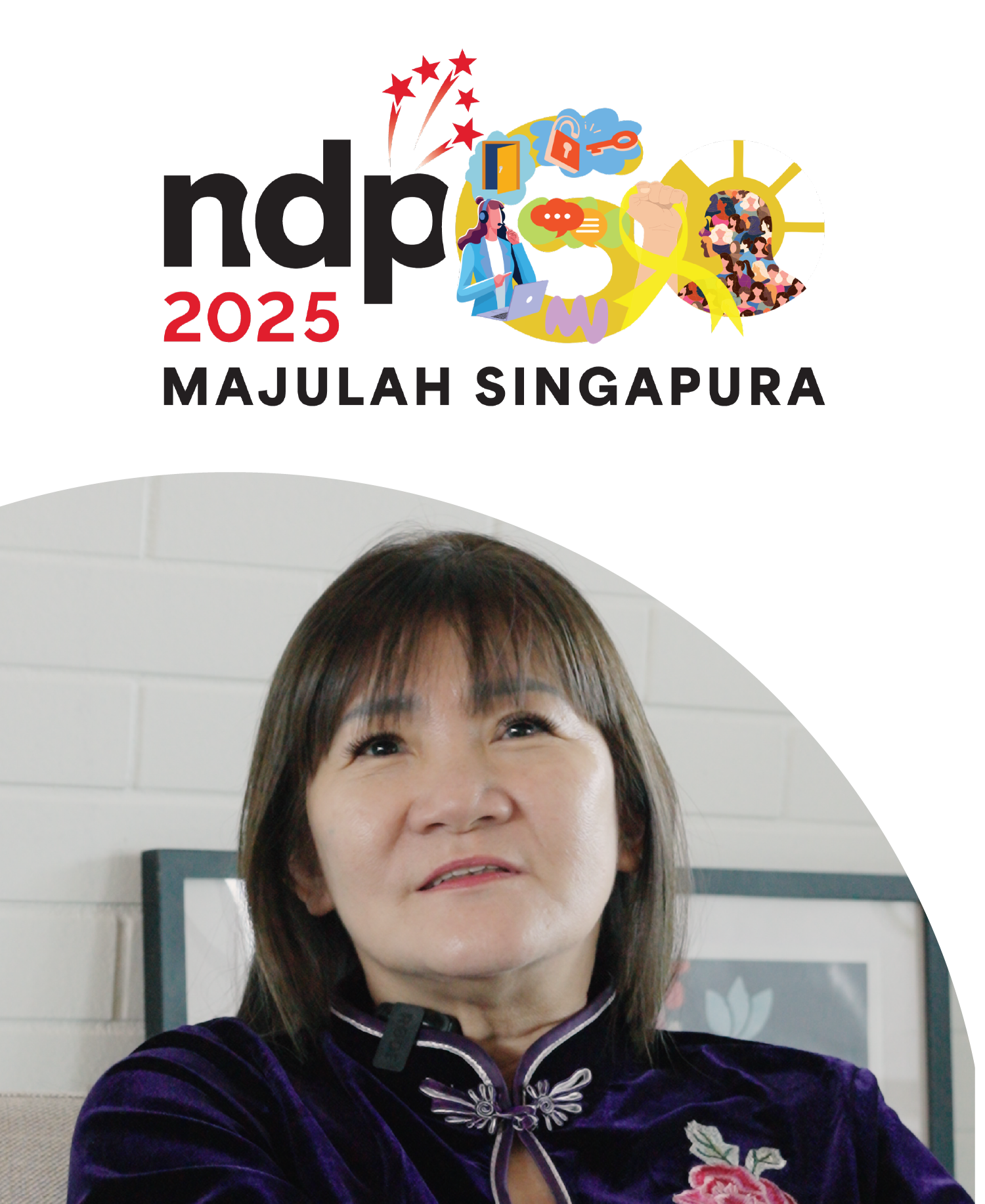
My design is inspired by Singapore’s shared humanity and the belief in second chances. Prominently featured are a padlock and key, symbolising the freedom to unlock one’s potential and the trust and opportunities that empower individuals to move beyond their past. I included the image of a call centre agent with a headset and laptop to highlight meaningful work, connection, and perseverance. Speech bubbles and communication icons convey the importance of empathy, dialogue, and authentic human connection in building a supportive community. A raised fist with a yellow ribbon stands for second chances, reintegration, and personal transformation. Finally, the sunburst silhouette filled with diverse faces reflects a vibrant, hopeful community united by the promise of new beginnings. My Singapore dream is for our nation to become truly inclusive where every individual, regardless of their history, is supported to overcome adversity and empowered to thrive.
Edward Yee
- Co-founder, Givfunds Head of Strategic Projects, FAR.AI
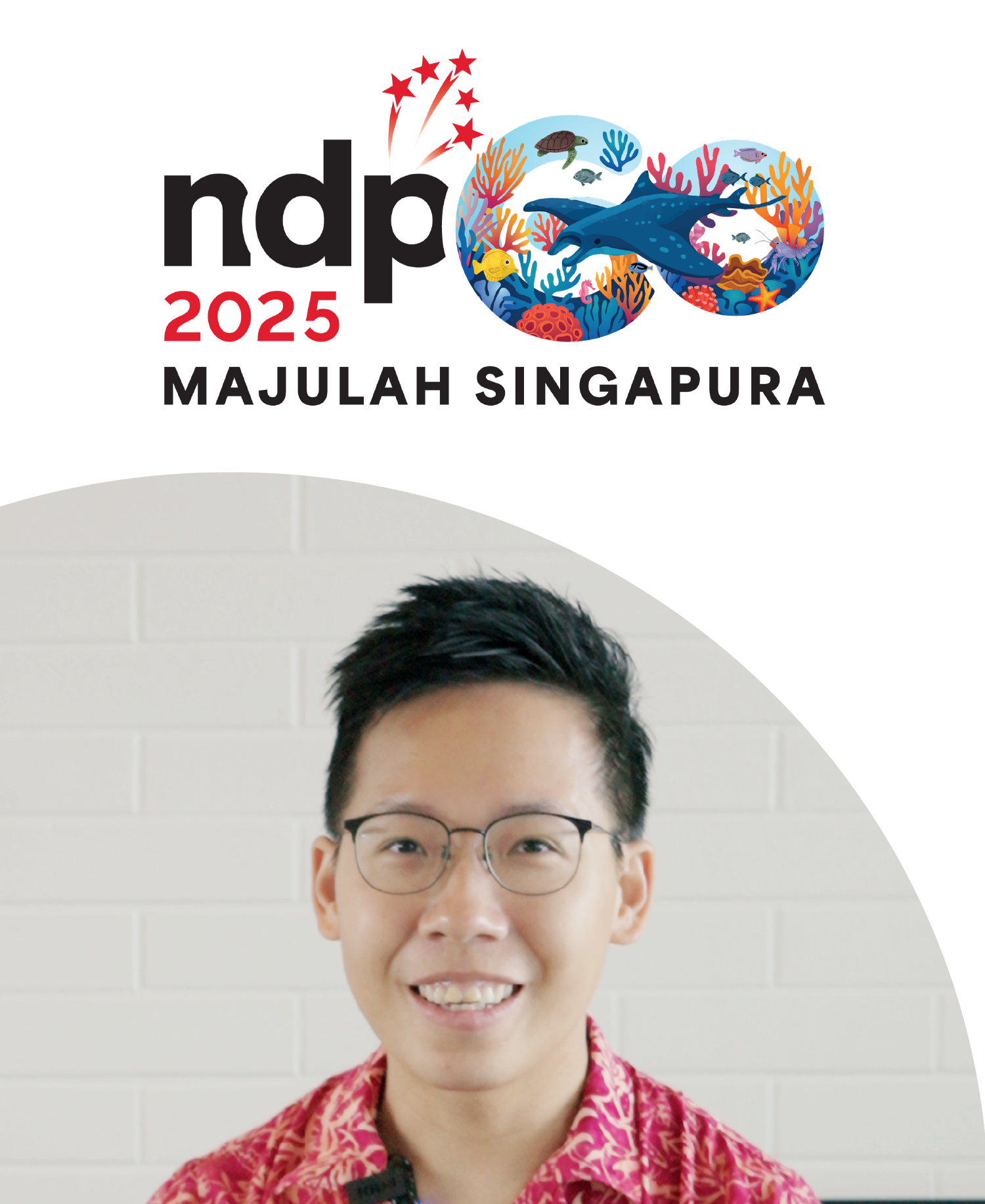
My logo design features a flourishing coral reef, serving as a vibrant metaphor for Singapore’s role in the world. I illustrated the reef’s intricate shapes and diverse marine life to highlight how, despite occupying less than 1% of the ocean, coral reefs sustain 25% of marine life, protect coastlines, and are crucial for nutrient recycling. Every organism, large or small, contributes to the ecosystem’s health, whether it’s a manta ray relying on tiny cleaner fish or coral polyps supporting countless species. I chose these elements to reflect Singapore’s experience as a small island nation facing complex global challenges like climate change, geopolitical shifts, and rapid technological change. Just as reefs thrive through unity and cooperation, Singapore’s resilience and continued success depend on collective effort and inclusivity. My Singapore dream is for our country to keep playing a vital role in shared prosperity, remaining strong and united through adversity, and ensuring everyone has a part in building a resilient and compassionate society.
Jamsairi Bin Kamaruddin
- Director, Kuo Chuan Arts and Cultural
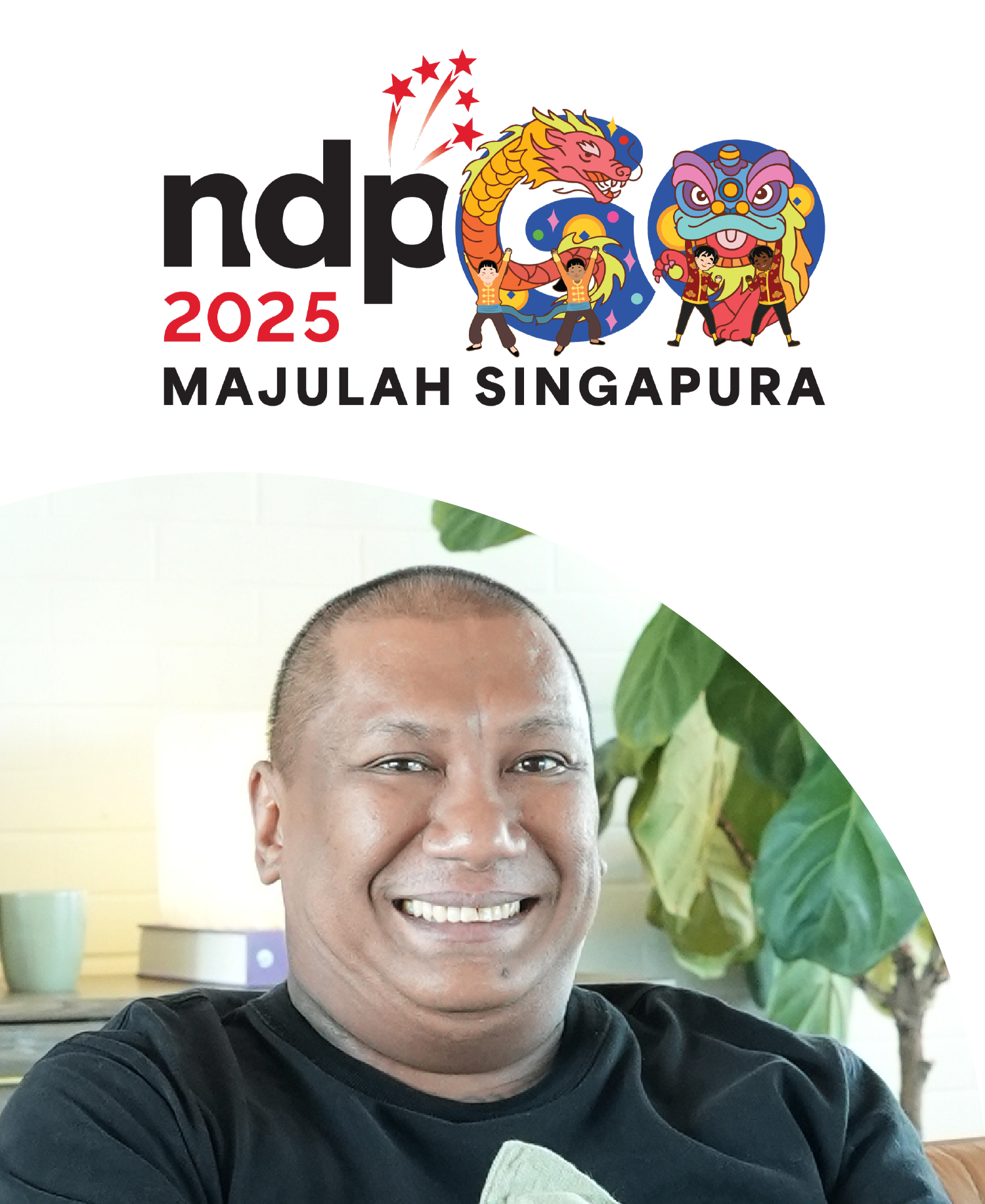
My logo design features a dragon dance integrated into the letter ‘G’ and a lion dance within the letter ‘O’. These elements pay homage to Singapore’s rich cultural heritage, representing traditions first introduced in the 1930s that have become enduring symbols of our nation’s journey. Although I am Malay by race, I chose the dragon and lion dances to reflect the ongoing progress of Singapore, as both have contributed to our vibrant arts and cultural landscape. The lion dance, especially, highlights the values of inclusivity and teamwork, bringing together people from diverse backgrounds to celebrate a cherished tradition. My Singapore dream is for our country to continue building a stronger, more united society, where everyone moves forward together, regardless of age, race, or religion.
Aaron Scott Donovan
- Social Worker, Fei Yue Community Services
My logo design incorporates a vibrant tapestry of Singapore life, with people from all walks of life, iconic landmarks, and everyday scenes woven into the motif. I chose to illustrate a diverse array of individuals alongside familiar sights like HDB flats, playgrounds, and our city skyline to reflect the many unique journeys that make up our nation. These elements highlight that success is not a single path, but a mosaic of passions, circumstances, and aspirations. My Singapore dream is for our community to embrace diverse definitions of success, empowering everyone to pursue their own goals whether in academics, the arts, caregiving, entrepreneurship, or living with integrity. In this society, every unique light adds to the brilliance of our collective shine.
Jason Chen
- Head of Department, Dunman High School / OneService Community Partner
My logo showcases students taking an active role in improving our living environment through community service. The hearts represent the various community partners my students collaborate with, each reflecting a different facet of service. Together with the Municipal Services Office (MSO), our students actively engage the community and tackle issues such as public cleanliness. Through simple yet meaningful gestures — a kind word, a listening ear, or lending a helping hand — our students learn that every action, no matter how small, contributes to a cleaner, more gracious and cohesive Singapore. My Singapore dream is to nurture youths who are empowered to make a positive difference in society, driven by empathy to serve with heart and purpose.
Chng Rui Jie
- Youngest Winner for President’s Volunteerism and Philanthropy Award
My design is inspired by what I believe defines Singapore today. It features four key elements: the concept of a garden city represented by flowers at the top, our rich food culture depicted through hawker tables at the centre, public housing and the spirit of community working together for a better future illustrated within the Letter ‘O’. Each aspect reflects the vibrancy and diversity that make me proud to be a Singaporean. I chose these elements to highlight the everyday things that shape our nation’s unique identity. My Singapore dream is to inspire people to appreciate what Singapore has to offer and to reflect on the small details that contribute to the country we know and love.
Maria Koh
- O’Joy Para Counsellor
The design features illustrations of the people I have worked with and befriended throughout my volunteer journey, each figure representing a unique story of shared purpose, commitment, and the joy of giving back. I chose to highlight these individuals to show how every volunteer, regardless of background, contributes to meaningful change in the communities we serve. The diverse figures symbolise the spirit of camaraderie and the lasting impact that collective action can have. My Singapore dream is to inspire every Singaporean to step forward and volunteer their time, skills, and heart for the community. Even the smallest acts of service can make a significant difference, helping to build a more compassionate, resilient, and united Singapore where no one is left behind.
Yip Pin Xiu
- Paralympic Gold Medalist
My design draws inspiration from my journey as a competitive swimmer, using the imagery of water and waves to symbolise Singapore’s progress as a nation. Swimming has taught me the importance of inclusivity, perseverance, and the strength found in community, lessons that resonate deeply with Singapore’s evolving spirit. Over the years, I’ve witnessed our society take meaningful steps toward embracing diversity and ensuring everyone is valued, regardless of ability or background. My Singapore dream is for our nation to grow as a truly inclusive society, where every individual feels seen, supported, and empowered to thrive. By uniting in mutual support and understanding, I believe we can overcome any challenge and ensure everyone has a place in Singapore’s story.

David King Thorairajan
- Entrepreneur, Motivational Speaker
My logo design features our national flower, Vanda Miss Joaquim, HDB flats, the famous durian, and a pigeon, all representing aspects of everyday life that are unique to Singapore’s character. These elements reflect what I love most about our nation. The use of vibrant colours, along with the pigeon and a person flying a kite, conveys a deeper message of hope and love—values I strongly believe should be at the heart of our society. My Singapore dream is for everyone to persevere through adversity and always hold on to hope, moving forward together with strength and unity.
Loh Kean Yew
- Badminton World Champion
My logo features a World Champion gold medal, symbolising the heights Singapore can achieve when we dare to dream big. I chose this imagery to reflect how, despite being a small country with limited human capital and resources, Singapore has never stopped pursuing her aspirations or discouraged her people from aiming high. The gold medal stands as a testament to the power of self-belief and the courage to pursue bold ambitions. My Singapore dream is for our nation to remain the brightest red dot on the world map, continually inspiring and empowering her people with the support they need to chase their dreams and turn them into reality, no matter the challenges ahead.

Suriani Soo
- Special Olympics Singapore Volunteer Coach
My logo features drawings of a vibrant sporting culture, showcasing athletes of diverse abilities and a variety of sports equipment. The illustrations of para-athletes in action, surrounded by yellow stars, symbolise Singapore’s commitment to inclusivity and excellence in sports. The collection of sports symbols and the Singapore flag represent unity, national pride, and the celebration of our nation’s sporting achievements. I chose these elements to reflect our belief that everyone, regardless of ability, deserves the chance to grow, compete, and be celebrated on the world stage. My Singapore dream is for our country to one day host the Paralympic and Special Olympics World Games, setting a global example of inclusion, hope, and the power of community.

Norliza Bte Miswan
- Trainee in MINDS
My logo showcases some of Singapore’s most iconic landmarks, such as Marina Bay Sands, the Merlion, and the Singapore Flyer. Each represents more than just buildings or attractions, they embody our history, achievements, and collective identity. Through these landmarks, I wanted to remind the world that even a small red dot like Singapore can stand tall on the global stage, telling a story of transformation from humble beginnings to a thriving, world-class nation. My Singapore dream is to see even more iconic landmarks rise in the years ahead, each reflecting our unique culture, innovation, and spirit. I hope these symbols will inspire future generations to take pride in our nation and continue building a legacy together.

Carrie Tan
- Social Entrepreneur & Transformation Coach, Lightbearers Collective
Singapore is often seen as a miracle nation that has grown rapidly, symbolised by the unicorn in my logo and surrounded by a kaleidoscope of flowers to represent the Chinese saying, “let a hundred flowers bloom.” Through my design, I hope to convey hope, inspiration, uplift, and joy, reminding everyone that Singapore must remain an inclusive nation where people and talents of all kinds have the space to blossom. This diversity is the magic and growth that has made Singapore what it is today. My Singapore dream is for our nation to keep breaking boundaries and boldly painting our aspirations beyond convention, ensuring that diversity and innovation continue to drive our progress.

Mohamed Salih Shaik Dawood
Deputy Rescue Rota Commander, Disaster Assistance and Rescue Team, SCDF
Through this logo, I hope to inspire confidence and assurance in all who see it. It serves as a reminder that trained professionals and essential resources stand ready to respond to emergencies across our nation. The use of red reflects the spirit of our emergency services — urgency, courage, and dedication. In contrast, blue conveys trust, stability, and calm — qualities that are vital in any emergency. Guided by the theme of Protection, Hope, and Unity, this logo seeks to foster a strong sense of shared responsibility and to empower every individual to step forward and make a difference, especially when lives are at stake. My Singapore dream is to nurture a nation of lifesavers — a resilient community where people are not only prepared, but also willing to support one another in times of need, including during everyday emergencies.
Jayden Sim
- OneService Community Volunteer
I designed this logo to inspire everyone to contribute to making Singapore greener and cleaner, even in small ways. When I was 9 years old, I started a project to recycle cloth pegs. I remember watching a video of a turtle getting hurt by a straw stuck in its nostril. It made me sad and that’s why I joined community clean-up projects like Stridy. I drew native animals, trees, and familiar places in Singapore because they illustrate how people and nature are interconnected. My Singapore dream is for us always to stay clean, green, and full of life! I believe that if all of us — kids and adults work together, we can protect the environment and make it better. Every little action counts, and together, we can keep our Singapore Home a beautiful place for everyone, including the flora and fauna that live here.

Nabillah Jalal
- Founder of ArtSee
The thumbprints symbolise identity, individuality, and legacy, and remind us that every citizen has a unique part to play in building our nation. I wanted my design to pay tribute to the countless hands, from the government to the community to each and every individual Singaporean, that shaped Singapore’s success. The heart brings out the values of unity, collaboration, and mutual support, showing how collective effort can uplift a society. My Singapore dream is for our nation to continue sharing perspectives openly, with trust and respect, even when we disagree. I believe meaningful dialogue thrives not on agreement but on understanding, ensuring that every voice is valued and every contribution counts will help us move forward together, stronger and more united.

Ang Peng Siong
- Singapore Swimming Legend
Inspired by Singapore’s identity as an island nation, my logo features waves encircling the island, symbolising both serenity and the challenges we face. I chose this design to reflect how Singaporeans continually navigate the calm and storms of life, drawing strength from our shared resilience and determination. I also envision a future where every Singaporean is empowered, much like a swimmer, to face challenges head-on, supported by unity and pride. My aspiration is that sports become a core part of our national identity, instilling pride, unity, and a drive to excel. Though our island may be small, our ambitions are vast, and together, we move forward with the Lion City’s spirit in our hearts, always reaching for greater heights.

Sun Yimei
- Trainee in MINDS
My logo features the iconic Merlion at its centre, symbolising my connection to the nation, our heritage, and our identity. I chose the Merlion to honour both our past and present, reflecting my hope that Singapore will continue to thrive in every way – economically, socially, and culturally. I am passionate about sports and will be participating in the upcoming Special Olympics 2025. This also inspired me to include elements of sports to embody the spirit of resilience and teamwork. My Singapore dream is to keep striving for excellence and be part of a society that celebrates diversity. I envision a future where every individual, regardless of ability, is empowered to achieve their full potential in a prosperous and inclusive Singapore.

Francesca Phoebe Wah
- Founder of Bringing Love to Every Single Soul (BLESS)
At the heart of my logo is a bridge fused with a heartbeat rhythm flowing between the “6” and “0,” serving as a quiet yet powerful reminder that our pioneers’ sacrifices continue to pulse through Singapore today. The “6” honours these pioneers, whose efforts in education, housing, infrastructure and healthcare laid our foundation. The heartbeat beginning at the “6” symbolises how pioneers set aside their personal interests to move in sync with the nation’s needs. The bridge carries us from the past to the future, and at the other end, our future is envisioned as one built on unity, innovation, sustainability, digital advancement. My Singapore dream is that every citizen keeps this heartbeat alive by putting Singapore first and building a future together.

Tengku Mohamed Boestaman
- Duty Operations Manager, SBS Transit
My NDP logo design captures the vibrant journey of how Singapore's public transport has evolved through the decades. It showcases our buses and trains set against the familiar landmarks of our city, reflecting how far we've come together as a nation over the past 60 years.
I've also chosen to feature our public transport workers — the unsung heroes whose dedication keep Singapore moving every day, rain or shine. By portraying our frontliners of different genders and races, I wanted to celebrate the multi-racial and multicultural society we live in, and the unity at the heart of our Singapore spirit.
My dream for Singapore is for public transport to be more resilient, accessible, and sustainable, so that everyone can continue to travel confidently and be part of this connected and thriving community.
⁰¹ Aisha Shamsudin
- Penyokong / penganjur / penasihat Kesihatan Mental.
Logo saya diilhamkan oleh perjalanan saya sebagai penyokong kesihatan mental dan menyatakan harapan saya untuk pertumbuhan berterusan Singapura. Huruf 'G' membentuk sepasang tangan yang membuai tunas dengan lembut, melambangkan kemajuan negara kita dan kepentingan untuk berpijak dan merendah diri. Imejan ini mencerminkan kepercayaan saya bahawa walaupun selepas 60 tahun, Singapura mesti terus belajar dan sentiasa bersedia untuk menyokong mereka yang memerlukan seperti mana tunas bergantung pada tanah yang memupuk dan tangan yang prihatin. Huruf 'O' direka dalam gaya cincin aktiviti jam tangan pintar, menawarkan gambaran peribadi tentang kehidupan saya sebagai anak muda Singapura. Setiap cincin merangkumi nilai utama, dari cincin luar hingga cincin dalam: "Cinta," peringatan untuk menunjukkan kebaikan kepada mereka yang membentuk kita; “Sumbangan,” mewakili komitmen saya terhadap advokasi kesihatan mental dan memartabatkan masyarakat Melayu-Islam; dan deringan ketiga, "Hadirkan", menggalakkan kita untuk menerima keadaan di sini dan sekarang walaupun dalam kepesatan kehidupan. Impian Singapura saya adalah untuk kita terus berhubung rapat sebagai komuniti yang menaikkan dan memperkasakan, sambil juga memupuk identiti unik setiap orang.
Aisha Shamsudin
- 心理健康倡导者。
我的标志灵感源自我作为心理健康倡导者的历程,并表达了我对新加坡持续发展的期许。字母“G”形似一双手,温柔地托着一颗幼苗,象征着我们国家的进步,以及脚踏实地和谦逊的重要性。这个意象反映了我的信念:即使过了60年,新加坡也必须不断学习,并时刻准备着为有需要的人提供支持,就像幼苗依靠滋养的土壤和关爱的双手一样。字母“O”采用智能手表活动圆环的风格,展现了我作为一名年轻新加坡人的个人生活。从外圈到内圈,每个圆环都体现着一个核心价值观:“爱”,提醒我们要善待塑造我们的人;“贡献”,代表着我对心理健康倡导和提升马来穆斯林社群的承诺;第三个圆环是“当下”,鼓励我们无论生活节奏如何,都要拥抱当下。 我的新加坡梦想是让我们紧密联系在一起,成为一个互相激励、互相赋能的社区,同时培养每个人的独特个性。
Aisha Shamsudin
- xīnlǐ jiànkāng chàngdǎo zhě.
Wǒ de biāozhì línggǎn yuán zì wǒ zuòwéi xīnlǐ jiànkāng chàngdǎo zhě de lìchéng, bìng biǎodále wǒ duì xīnjiāpō chíxù fāzhǎn de qíxǔ. Zìmǔ “G” xíngsì yī shuāngshǒu, wēnróu de tuōzhe yī kē yòumiáo, xiàngzhēngzhe wǒmen guójiā de jìnbù, yǐjí jiǎotàshídì hé qiānxùn de zhòngyào xìng. Zhège yìxiàng fǎnyìngle wǒ de xìnniàn: Jíshǐguòle 60 nián, xīnjiāpō yě bìxū bùduàn xuéxí, bìng shíkè zhǔnbèizhe wèi yǒu xūyào de rén tígōng zhīchí, jiù xiàng yòumiáo yīkào zīyǎng de tǔrǎng hé guān'ài de shuāngshǒu yīyàng. Zìmǔ “O” cǎiyòng zhìnéng shǒubiǎo huódòng yuán huán de fēnggé, zhǎnxiànle wǒ zuòwéi yī míng niánqīng xīnjiāpō rén de gèrén shēnghuó. Cóng wài quān dào nèi quān, měi gè yuán huán dōu tǐxiànzhe yīgè héxīn jiàzhíguān:“Ài”, tíxǐng wǒmen yào shàndài sùzào wǒmen de rén;“gòngxiàn”, dàibiǎozhuó wǒ duì xīnlǐ jiànkāng chàngdǎo hé tíshēng mǎ lái mùsīlín shè qún de chéngnuò; dì sān gè yuán huán shì “dāngxià”, gǔlì wǒmen wúlùn shēnghuó jiézòu rúhé, dōu yào yǒngbào dāngxià. Wǒ de xīnjiāpō mèngxiǎng shì ràng wǒmen jǐnmì liánxì zài yīqǐ, chéngwéi yīgè hùxiāng jīlì, hùxiāng fù néng de shèqū, tóngshí péiyǎng měi gèrén de dútè gèxìng.
ஆயிஷா ஷம்சுதீன்
- மனநல வழக்கறிஞர்.
எனது லோகோ ஒரு மனநல ஆலோசகராக எனது பயணத்தால் ஈர்க்கப்பட்டு, சிங்கப்பூரின் தொடர்ச்சியான வளர்ச்சிக்கான எனது நம்பிக்கையை வெளிப்படுத்துகிறது. 'G' என்ற எழுத்து ஒரு முளையை மெதுவாகத் தொட்டுக் கொண்டிருக்கும் ஒரு ஜோடி கைகளை உருவாக்குகிறது, இது நமது நாட்டின் முன்னேற்றத்தையும், அடித்தளமாகவும் பணிவாகவும் இருப்பதன் முக்கியத்துவத்தையும் குறிக்கிறது. 60 ஆண்டுகளுக்குப் பிறகும், சிங்கப்பூர் தொடர்ந்து கற்றுக் கொள்ள வேண்டும் மற்றும் தேவைப்படுபவர்களை ஆதரிக்கத் தயாராக இருக்க வேண்டும் என்ற எனது நம்பிக்கையை இந்தப் படங்கள் பிரதிபலிக்கின்றன, முளை மண்ணை வளர்ப்பதையும் அக்கறையுள்ள கைகளையும் சார்ந்துள்ளது. 'O' என்ற எழுத்து ஸ்மார்ட்வாட்ச் செயல்பாட்டு வளையங்களின் பாணியில் வடிவமைக்கப்பட்டுள்ளது, இது ஒரு இளம் சிங்கப்பூரராக எனது வாழ்க்கையின் தனிப்பட்ட பிரதிபலிப்பை வழங்குகிறது. ஒவ்வொரு மோதிரமும் வெளிப்புற வளையத்திலிருந்து உள் வளையம் வரை ஒரு முக்கிய மதிப்பை உள்ளடக்கியது: "அன்பு", நம்மை வடிவமைப்பவர்களுக்கு கருணை காட்ட ஒரு நினைவூட்டல்; மனநல ஆதரவிற்கும் மலாய்-முஸ்லிம் சமூகத்தை மேம்படுத்துவதற்கும் எனது உறுதிப்பாட்டைக் குறிக்கும் "பங்களிப்பு"; மற்றும் மூன்றாவது வளையம், "தற்போது", வாழ்க்கையின் வேகம் இருந்தபோதிலும் இங்கேயும் இப்போதும் தழுவிக்கொள்ள நம்மை ஊக்குவிக்கிறது. ஒவ்வொரு நபரின் தனித்துவமான அடையாளத்தையும் வளர்க்கும் அதே வேளையில், மேம்படுத்தும் மற்றும் அதிகாரம் அளிக்கும் ஒரு சமூகமாக நாம் நெருக்கமாக இணைந்திருக்க வேண்டும் என்பதே எனது சிங்கப்பூர் கனவு.
Āyiṣā ṣamcutīṉ
- maṉanala vaḻakkaṟiñar.
Eṉatu lōkō oru maṉanala ālōcakarāka eṉatu payaṇattāl īrkkappaṭṭu, ciṅkappūriṉ toṭarcciyāṉa vaḷarccikkāṉa eṉatu nampikkaiyai veḷippaṭuttukiṟatu. 'G' eṉṟa eḻuttu oru muḷaiyai metuvākat toṭṭuk koṇṭirukkum oru jōṭi kaikaḷai uruvākkukiṟatu, itu namatu nāṭṭiṉ muṉṉēṟṟattaiyum, aṭittaḷamākavum paṇivākavum iruppataṉ mukkiyattuvattaiyum kuṟikkiṟatu. 60 Āṇṭukaḷukkup piṟakum, ciṅkappūr toṭarntu kaṟṟuk koḷḷa vēṇṭum maṟṟum tēvaippaṭupavarkaḷai ātarikkat tayārāka irukka vēṇṭum eṉṟa eṉatu nampikkaiyai intap paṭaṅkaḷ piratipalikkiṉṟaṉa, muḷai maṇṇai vaḷarppataiyum akkaṟaiyuḷḷa kaikaḷaiyum cārntuḷḷatu. 'O' eṉṟa eḻuttu smārṭvāṭc ceyalpāṭṭu vaḷaiyaṅkaḷiṉ pāṇiyil vaṭivamaikkappaṭṭuḷḷatu, itu oru iḷam ciṅkappūrarāka eṉatu vāḻkkaiyiṉ taṉippaṭṭa piratipalippai vaḻaṅkukiṟatu. Ovvoru mōtiramum veḷippuṟa vaḷaiyattiliruntu uḷ vaḷaiyam varai oru mukkiya matippai uḷḷaṭakkiyatu: "Aṉpu", nam'mai vaṭivamaippavarkaḷukku karuṇai kāṭṭa oru niṉaivūṭṭal; maṉanala ātaraviṟkum malāy-muslim camūkattai mēmpaṭuttuvataṟkum eṉatu uṟutippāṭṭaik kuṟikkum"paṅkaḷippu"; maṟṟum mūṉṟāvatu vaḷaiyam, "taṟpōtu", vāḻkkaiyiṉ vēkam iruntapōtilum iṅkēyum ippōtum taḻuvikkoḷḷa nam'mai ūkkuvikkiṟatu. Ovvoru napariṉ taṉittuvamāṉa aṭaiyāḷattaiyum vaḷarkkum atē vēḷaiyil, mēmpaṭuttum maṟṟum atikāram aḷikkum oru camūkamāka nām nerukkamāka iṇaintirukka vēṇṭum eṉpatē eṉatu ciṅkappūr kaṉavu.
• Aisha Shamsudin
- Défenseure de la santé mentale.
Mon logo s'inspire de mon parcours de défenseuse de la santé mentale et exprime mes espoirs pour la croissance continue de Singapour. La lettre « G » forme une paire de mains tenant délicatement une pousse, symbolisant le progrès de notre nation et l'importance de l'humilité et de l'ancrage. Cette image reflète ma conviction que, même après 60 ans, Singapour doit continuer à apprendre et rester prête à soutenir ceux qui en ont besoin, tout comme la pousse dépend d'un sol fertile et de mains bienveillantes. La lettre « O » est conçue à la manière des anneaux d'activité des montres connectées, offrant une réflexion personnelle sur ma vie de jeune Singapourienne. Chaque anneau incarne une valeur fondamentale, de l'anneau extérieur à l'anneau intérieur : « Amour », un rappel de la bienveillance envers ceux qui nous façonnent ; « Contribution », représentant mon engagement en faveur de la santé mentale et de l'épanouissement de la communauté malaiso-musulmane ; et le troisième anneau, « Présent », nous encourageant à profiter de l'instant présent malgré le rythme de la vie. Mon rêve à Singapour est que nous restions étroitement connectés en tant que communauté qui élève et responsabilise, tout en nourrissant l’identité unique de chaque personne.
⁰² Pamela Tan - Jururawat Kakitangan Kanan, Hospital Wanita dan Kanak-kanak Kandang Kerbau.
Reka bentuk logo saya menyatukan perjalanan hidup, bermula dengan peringkat kehamilan dan kitaran pertumbuhan dalam "6." Kedua-dua warna digabungkan untuk membentuk ungu, mempamerkan penyatuan gen ibu dan bapa dalam penciptaan kehidupan. Irama jantung ibu ditekankan selepas ujian kehamilan positif, kerana janinnya mengembangkan degupan jantung dan hubungan istimewa dengannya. Iramanya juga menggambarkan suka dan duka dalam perjalanan kehamilan. "0" merangkumi pasangan berbilang kaum yang memeluk bayi mereka yang baru lahir, tumbuhan bercambah dari kasih sayang mereka yang memupuk mewakili anak mereka yang sedang membesar. Seorang profesional penjagaan kesihatan menyiramnya dan menyokong keluarga. Bumbung merah menyerlahkan perlindungan dan penjagaan dari hospital ke rumah. Impian Singapura saya adalah untuk setiap ibu diperkasakan dalam menyediakan persekitaran terbaik untuk diri mereka dan anak-anak mereka untuk berkembang maju dan berkembang bersama.
பமீலா டான்
- மூத்த பணியாளர் செவிலியர், கண்டாங் கெர்பாவ் பெண்கள் மற்றும் குழந்தைகள் மருத்துவமனை.
எனது லோகோ வடிவமைப்பு, கர்ப்பத்தின் நிலைகள் மற்றும் வளர்ச்சி சுழற்சியில் தொடங்கி, "6" இல் தொடங்கும் வாழ்க்கைப் பயணத்தை ஒன்றாக இணைக்கிறது. இரண்டு வண்ணங்களும் இணைந்து இளஞ்சிவப்பு நிறத்தை உருவாக்குகின்றன, இது வாழ்க்கை உருவாக்கத்தில் தாய் மற்றும் தந்தைவழி மரபணுக்களின் ஒன்றியத்தைக் காட்டுகிறது. நேர்மறை கர்ப்ப பரிசோதனைக்குப் பிறகு தாயின் இதயத் தாளங்கள் வலியுறுத்தப்படுகின்றன, ஏனெனில் அவளுடைய கரு இதயத் துடிப்பையும் அவளுடன் சிறப்பு தொடர்பையும் உருவாக்குகிறது. தாளமும், கர்ப்பப் பயணத்தின் உயர் மற்றும் தாழ்வுகளை சித்தரிக்கிறது. "0" என்பது பல இன தம்பதியினர் தங்கள் புதிதாகப் பிறந்த குழந்தையைத் தொட்டிலில் சுமந்து செல்வதை உள்ளடக்கியது, அவர்களின் வளரும் குழந்தையை பிரதிநிதித்துவப்படுத்தும் அவர்களின் வளர்ப்பு அன்பிலிருந்து முளைக்கும் செடி. ஒரு சுகாதார நிபுணர் அதற்கு நீர் ஊற்றி குடும்பத்தை ஆதரிக்கிறார். சிவப்பு கூரை மருத்துவமனையிலிருந்து வீடு வரை பாதுகாப்பு மற்றும் பராமரிப்பை எடுத்துக்காட்டுகிறது. ஒவ்வொரு தாயும் தங்களுக்கும் தங்கள் குழந்தைகளுக்கும் ஒன்றாக செழித்து வளர சிறந்த சூழலை வழங்குவதில் அதிகாரம் பெற வேண்டும் என்பதே எனது சிங்கப்பூர் கனவு.
Pamīlā ṭāṉ
- mūtta paṇiyāḷar ceviliyar, kaṇṭāṅ kerpāv peṇkaḷ maṟṟum kuḻantaikaḷ maruttuvamaṉai.
Eṉatu lōkō vaṭivamaippu, karppattiṉ nilaikaḷ maṟṟum vaḷarcci cuḻaṟciyil toṭaṅki, "6" il toṭaṅkum vāḻkkaip payaṇattai oṉṟāka iṇaikkiṟatu. Iraṇṭu vaṇṇaṅkaḷum iṇaintu iḷañcivappu niṟattai uruvākkukiṉṟaṉa, itu vāḻkkai uruvākkattil tāy maṟṟum tantaivaḻi marapaṇukkaḷiṉ oṉṟiyattaik kāṭṭukiṟatu. Nērmaṟai karppa paricōtaṉaikkup piṟaku tāyiṉ itayat tāḷaṅkaḷ valiyuṟuttappaṭukiṉṟaṉa, ēṉeṉil avaḷuṭaiya karu itayat tuṭippaiyum avaḷuṭaṉ ciṟappu toṭarpaiyum uruvākkukiṟatu. Tāḷamum, karppap payaṇattiṉ uyar maṟṟum tāḻvukaḷai cittarikkiṟatu. "0" Eṉpatu pala iṉa tampatiyiṉar taṅkaḷ putitākap piṟanta kuḻantaiyait toṭṭilil cumantu celvatai uḷḷaṭakkiyatu, avarkaḷiṉ vaḷarum kuḻantaiyai piratinitittuvappaṭuttum avarkaḷiṉ vaḷarppu aṉpiliruntu muḷaikkum ceṭi. Oru cukātāra nipuṇar ataṟku nīr ūṟṟi kuṭumpattai ātarikkiṟār. Civappu kūrai maruttuvamaṉaiyiliruntu vīṭu varai pātukāppu maṟṟum parāmarippai eṭuttukkāṭṭukiṟatu. Ovvoru tāyum taṅkaḷukkum taṅkaḷ kuḻantaikaḷukkum oṉṟāka ceḻittu vaḷara ciṟanta cūḻalai vaḻaṅkuvatil atikāram peṟa vēṇṭum eṉpatē eṉatu ciṅkappūr kaṉavu.
Pamela Tan
- 甘当卡保妇女儿童医院高级护士。
我的标志设计将生命旅程交织在一起,从怀孕的各个阶段开始,并以数字“6”的形式展现成长的周期。两种颜色融合成淡紫色,展现了母性基因和父性基因在生命创造中的结合。孕检呈阳性后,母亲的心律被强调,因为她的胎儿正在发育,并与母亲建立起特殊的联系。这种心律也描绘了怀孕过程中的起起伏伏。数字“0”象征着一对多种族夫妇怀抱新生儿,他们用爱心培育的幼苗代表着他们正在成长的孩子。一位医护人员为它浇水,为这个家庭提供支持。红色的屋顶象征着从医院到家庭的守护和关爱。我的新加坡梦想是让每一位母亲都能为自己和孩子创造最佳环境,共同成长。
Pamela Tan
- gān dāng kǎ bǎo fùnǚ értóng yīyuàn gāojí hùshì.
Wǒ de biāozhì shèjì jiāng shēngmìng lǚchéng jiāozhī zài yīqǐ, cóng huáiyùn de gège jiēduàn kāishǐ, bìng yǐ shùzì “6” de xíngshì zhǎnxiàn chéngzhǎng de zhōuqí. Liǎng zhǒng yánsè rónghé chéng dàn zǐsè, zhǎnxiànle mǔxìng jīyīn hé fùxìng jīyīn zài shēngmìng chuàngzào zhōng de jiéhé. Yùn jiǎn chéng yángxìng hòu, mǔqīn de xīnlǜ bèi qiángdiào, yīnwèi tā de tāi'ér zhèngzài fāyù, bìng yǔ mǔqīn jiànlì qǐ tèshū de liánxì. Zhè zhǒng xīnlǜ yě miáohuìle huáiyùn guòchéng zhōng de qǐ qǐfú fú. Shùzì “0” xiàngzhēngzhe yī duì duō zhǒngzú fūfù huáibào xīnshēng ér, tāmen yòng àixīn péiyù de yòumiáo dàibiǎozhuó tāmen zhèngzài chéngzhǎng de háizǐ. Yī wèi yīhù rényuán wèi tā jiāo shuǐ, wèi zhège jiātíng tígōng zhīchí. Hóngsè de wūdǐng xiàngzhēngzhe cóng yīyuàn dào jiātíng de shǒuhù hé guān'ài. Wǒ de xīnjiāpō mèngxiǎng shì ràng měi yī wèi mǔqīn dōu néng wéi zìjǐ hé háizǐ chuàngzào zuì jiā huánjìng, gòngtóng chéngzhǎng.
Pamela Tan - Senior Staff Nurse, Kandang Kerbau Woman's and Children's Hospital.
My logo design weaves together the journey of life, starting with the stages of pregnancy and the cycle of growth in the “6.” The two colours blend to form lilac, showcasing the union of maternal and paternal genes in life creation. The mother’s heart rhythms are emphasised after the positive pregnancy test, as her foetus develops a heartbeat and special connection to her. The rhythm, too, depicts the highs and lows of the pregnancy journey. The “0” encapsulates a multi-racial couple cradling their newborn, the sprouting plant from their nurturing love representing their growing child. A healthcare professional waters it and supports the family. The red roof highlights protection and care from hospital to home. My Singapore dream is for every mother to be empowered in providing the best environment for themselves and their children to thrive and flourish together.
Pamela Tan ~ Infirmière en chef, Hôpital pour femmes et enfants de Kandang Kerbau.
Mon logo tisse le parcours de la vie, en commençant par les étapes de la grossesse et le cycle de croissance, le « 6 ». Les deux couleurs se fondent pour former le lilas, illustrant l'union des gènes maternels et paternels dans la création de la vie. Le rythme cardiaque de la mère est mis en valeur après le test de grossesse positif, tandis que son fœtus développe un battement et un lien particulier avec elle. Ce rythme, lui aussi, illustre les hauts et les bas de la grossesse. Le « 0 » symbolise un couple multiracial berçant son nouveau-né, la plante née de leur amour nourricier représentant leur enfant en pleine croissance. Un professionnel de santé l'arrose et soutient la famille. Le toit rouge symbolise la protection et les soins, de l'hôpital au domicile. Mon rêve à Singapour est que chaque mère puisse offrir le meilleur environnement possible pour qu'elle et ses enfants puissent s'épanouir ensemble.
⁰³ Neyati Umamaheswar - Pengasas Minds Untangled. Pengasas fikiran terurai.
Melalui logo saya, saya berhasrat untuk menunjukkan sejauh mana Singapura telah dicapai dan kemungkinan yang menjanjikan di hadapan, terutamanya dalam cara rakyat Singapura mengambil berat antara satu sama lain. Reka bentuk saya menampilkan otak dan banyak tangan yang bersatu dalam sokongan, kepercayaan dan perpaduan. Otak mewakili Singapura berfokus pada masa depan yang menghargai kedua-dua intelek dan emosi, mengingatkan kita bahawa kesihatan mental menyentuh semua orang dan bahawa kita bertambah kuat dengan merangkumi semua aspek diri kita. Bintang melambangkan kebanggaan negara kita dan aspirasi belia kita, yang membawa impian hari esok. Tangan bersatu sebagai satu mencerminkan harapan saya untuk masyarakat yang lebih belas kasihan di mana setiap orang mengangkat satu sama lain. Impian Singapura saya adalah untuk negara kita berkembang maju melalui pertumbuhan berterusan, dipandu oleh minda terbuka dan hati yang berani, bersatu dalam kepelbagaian kita.
நேயாதி உமாமகேஸ்வர் - மைண்ட்ஸ் அன்டாங்கிள்டு நிறுவனர் (குழப்பம் நீங்கிய மனங்கள்)
எனது லோகோ மூலம், சிங்கப்பூர் எவ்வளவு தூரம் முன்னேறியுள்ளது என்பதையும், எதிர்காலத்திற்கான நம்பிக்கைக்குரிய சாத்தியக்கூறுகளையும், குறிப்பாக சிங்கப்பூரர்கள் ஒருவருக்கொருவர் எவ்வாறு அக்கறை காட்டுகிறார்கள் என்பதையும் காட்டுவதே எனது நோக்கமாகும். எனது வடிவமைப்பில் ஒரு மூளையும் பல கைகளும் ஆதரவு, நம்பிக்கை மற்றும் ஒற்றுமையில் ஒன்றிணைகின்றன. மூளை எதிர்காலத்தை மையமாகக் கொண்ட சிங்கப்பூரைக் குறிக்கிறது, இது அறிவு மற்றும் உணர்ச்சி இரண்டையும் மதிக்கிறது, மன ஆரோக்கியம் அனைவரையும் தொடுகிறது என்பதையும், நமது அனைத்து அம்சங்களையும் தழுவுவதன் மூலம் நாம் வலுவாக வளர்கிறோம் என்பதையும் நமக்கு நினைவூட்டுகிறது. நட்சத்திரங்கள் நமது தேசியப் பெருமையையும், நாளைய கனவுகளைச் சுமக்கும் நமது இளைஞர்களின் அபிலாஷைகளையும் அடையாளப்படுத்துகின்றன. ஒன்றாக இணைந்த கைகள், அனைவரும் ஒருவரையொருவர் உயர்த்தும் மிகவும் இரக்கமுள்ள சமூகத்திற்கான எனது நம்பிக்கையை பிரதிபலிக்கின்றன. திறந்த மனது மற்றும் தைரியமான இதயங்களால் வழிநடத்தப்பட்டு, நமது பன்முகத்தன்மையில் ஒன்றுபட்ட நமது தேசம் தொடர்ச்சியான வளர்ச்சியின் மூலம் செழிக்க வேண்டும் என்பதே எனது சிங்கப்பூர் கனவு.
Nēyāti umāmakēsvar - maiṇṭs aṉṭāṅkiḷṭu niṟuvaṉar (Kuḻappam nīṅkiya maṉaṅkaḷ)
eṉatu lōkō mūlam, ciṅkappūr evvaḷavu tūram muṉṉēṟiyuḷḷatu eṉpataiyum, etirkālattiṟkāṉa nampikkaikkuriya cāttiyakkūṟukaḷaiyum, kuṟippāka ciṅkappūrarkaḷ oruvarukkoruvar evvāṟu akkaṟai kāṭṭukiṟārkaḷ eṉpataiyum kāṭṭuvatē eṉatu nōkkamākum. Eṉatu vaṭivamaippil oru mūḷaiyum pala kaikaḷum ātaravu, nampikkai maṟṟum oṟṟumaiyil oṉṟiṇaikiṉṟaṉa. Mūḷai etirkālattai maiyamākak koṇṭa ciṅkappūraik kuṟikkiṟatu, itu aṟivu maṟṟum uṇarcci iraṇṭaiyum matikkiṟatu, maṉa ārōkkiyam aṉaivaraiyum toṭukiṟatu eṉpataiyum, namatu aṉaittu amcaṅkaḷaiyum taḻuvuvataṉ mūlam nām valuvāka vaḷarkiṟōm eṉpataiyum namakku niṉaivūṭṭukiṟatu. Naṭcattiraṅkaḷ namatu tēciyap perumaiyaiyum, nāḷaiya kaṉavukaḷaic cumakkum namatu iḷaiñarkaḷiṉ apilāṣaikaḷaiyum aṭaiyāḷappaṭuttukiṉṟaṉa. Oṉṟāka iṇainta kaikaḷ, aṉaivarum oruvaraiyoruvar uyarttum mikavum irakkamuḷḷa camūkattiṟkāṉa eṉatu nampikkaiyai piratipalikkiṉṟaṉa. Tiṟanta maṉatu maṟṟum tairiyamāṉa itayaṅkaḷāl vaḻinaṭattappaṭṭu, namatu paṉmukattaṉmaiyil oṉṟupaṭṭa namatu tēcam toṭarcciyāṉa vaḷarcciyiṉ mūlam ceḻikka vēṇṭum eṉpatē eṉatu ciṅkappūr kaṉavu.
Neyati Umamaheswar - Minds Untangled 创始人: 理清思绪 创始人
我希望通过我的标志展现新加坡的进步和未来的无限可能,尤其是在新加坡人如何彼此关爱方面。我的设计以一个大脑和许多双手为主题,它们汇聚在一起,互相支持、信任、团结。大脑象征着面向未来的新加坡,重视智力和情感,提醒我们心理健康关乎每个人,而我们只有拥抱自身的方方面面才能变得更强大。星星象征着我们的民族自豪感和承载着未来梦想的青年人的抱负。团结一致的双手则体现了我对一个更加富有同情心、人人互助的社会的期盼。我的新加坡梦是,我们的国家在开放的思想和勇敢的心的指引下,在多元文化中团结一心,通过持续发展而繁荣昌盛。
Neyati Umamaheswar - Minds Untangled chuàngshǐ rén. Lǐ qīng sīxù chuàngshǐ rén.
wǒ xīwàng tōngguò wǒ de biāozhì zhǎnxiàn xīnjiāpō de jìnbù hé wèilái de wúxiàn kěnéng, yóuqí shì zài xīnjiāpō rén rúhé bǐcǐ guān'ài fāngmiàn. Wǒ de shèjì yǐ yīgè dànǎo hé xǔduō shuāngshǒu wéi zhǔtí, tāmen huìjù zài yīqǐ, hùxiāng zhīchí, xìnrèn, tuánjié. Dànǎo xiàngzhēngzhe miànxiàng wèilái de xīnjiāpō, zhòngshì zhìlì hé qínggǎn, tíxǐng wǒmen xīnlǐ jiànkāng guānhū měi gèrén, ér wǒmen zhǐyǒu yǒngbào zìshēn de fāngfāngmiànmiàn cáinéng biàn dé gèng qiángdà. Xīngxīng xiàngzhēngzhe wǒmen de mínzú zìháo gǎn hé chéngzàizhe wèilái mèngxiǎng de qīngnián rén de bàofù. Tuánjié yīzhì de shuāngshǒu zé tǐxiànle wǒ duì yīgè gèngjiā fùyǒu tóngqíng xīn, rén rén hùzhù de shèhuì de qī pàn. Wǒ de xīnjiāpō mèng shì, wǒmen de guójiā zài kāifàng de sīxiǎng hé yǒnggǎn de xīn de zhǐyǐn xià, zài duōyuán wénhuà zhōng tuánjié yīxīn, tōngguò chíxù fāzhǎn ér fánróng chāngshèng.
Neyati Umamaheswar - Founder of Minds Untangled.
Through my logo, I aim to show both how far Singapore has come and the promising possibilities ahead, especially in how Singaporeans care for one another. My design features a brain and many hands coming together in support, trust, and unity. The brain represents a future-focused Singapore that values both intellect and emotion, reminding us that mental health touches everyone and that we grow stronger by embracing all aspects of ourselves. The stars symbolise our national pride and the aspirations of our youth, who carry tomorrow’s dreams. The hands united as one reflect my hope for a more compassionate society where everyone uplifts each other. My Singapore dream is for our nation to thrive through continuous growth, guided by open minds and courageous hearts, united in our diversity.
Neyati Umamaheswar - Fondatrice de Minds Untangled: Fondatrice de esprits démêlés
Avec mon logo, je souhaite illustrer le chemin parcouru par Singapour et les perspectives prometteuses qui s'offrent à nous, notamment en ce qui concerne l'entraide entre les Singapouriens. Mon design représente un cerveau et de nombreuses mains unies, signe de soutien, de confiance et d'unité. Le cerveau représente un Singapour tourné vers l'avenir, valorisant à la fois l'intellect et les émotions, nous rappelant que la santé mentale touche chacun et que nous devenons plus forts en acceptant toutes les facettes de nous-mêmes. Les étoiles symbolisent notre fierté nationale et les aspirations de notre jeunesse, porteuse des rêves de demain. Les mains jointes reflètent mon espoir d'une société plus bienveillante, où chacun s'encourage mutuellement. Mon rêve singapourien est de voir notre nation prospérer grâce à une croissance continue, guidée par l'ouverture d'esprit et le courage, unie dans notre diversité.
⁰⁴

No comments:
Post a Comment